About
Biography
Over the past decade, Gerard has built and advised top-notch digital accessibility teams that have impacted millions of individuals worldwide. His experience ranges from supporting commercial financial applications responsible for transferring trillions of dollars globally, to enhancing accessibility on pre-Elon Twitter. Recently, Gerard helped drive the Atlassian Design System Accessibility Team where he collaborated with a group of exceptional designers and engineers to help enhance the accessibility of components used to build team productivity tools like Jira, Confluence, and Trello.
Gerard is recognized as a catalyst for change, igniting cultural transformation at both grassroots and executive levels. He possesses an understanding of the interdisciplinary nature of digital accessibility and effectively bridges gaps between HR, Legal, Marketing, Product, Design, Engineering and Quality Assurance teams.
He has a remarkable history of advocating for individuals with disabilities and promoting diversity and fairness in the workplace. Moreover, he is highly regarded for his expertise, as evidenced by his frequent speaking engagements at conferences nationwide and the widespread recognition of his courses on the Pluralsight learning platform as essential training for organizations worldwide.
History
Over the last 25 years, I have spent most of my life sitting in front of some kind of digital display. Whether it was as an Enterprise-class Systems Engineer, developing motion detection and digital video surveillance systems, or apps to distribute 3d medical animations, I have been eternally waiting on some kind of "Please wait..." indicator. It wasn't until 2012 that I took the question "Do you know ARIA?" as a challenge to learn about accessibility.
At that point, I took my understanding of web fundamentals (HTML, CSS, and JavaScript) and started thinking of the experiental impacts to people, above and beyond just metrics and performance. Being heavily influenced by Jeffrey Zeldman, Eric Meyer, Douglas Crockford, Nicholas Zakas, Lea Verou, and Steve Souders was a great base for pure front end engineering. Added on top that of that was a lot of Steve Faulkner, Leonie Watson, and Derek Featherstone to round out my learnings in accessibility and make me a well rounded front end engineer.
In 2016, I took the opportunity to move from engineering to the design side and work closely with creatives to design accessible applications, offering input from what I knew about the browser. This was a big, scary paradigm shift for me, but it was a new world I was willing to explore. Being surrounded by designers, I was able to get relevant knowledge in customer experience. I then had the opportunity to establish a team of accessibility subject matter experts to scale out accessibility across the organization. I was very fortunate in being able to lead such a stellar group of individuals that I have learned a lot from, each and every one of them, like sandpaper smoothing out my rough edges.
As much as I loved my team and the work we were doing, I could not pass up the opportunity to make a global method of communication more accessible to people with disabilities by becoming the Engineering Manager for the newly formed Accessibility Experience Team at Twitter. As a team, we quickly established a culture of inclusion and made improvements to major surfaces including Spaces, Communities, media, timeline, and DMs. My proudest accomplishment was our work to increase image descriptions (alt-text) via the ALT badge + ALT reminder experience, increasing global image-description usage by 1900% within six months; and profiled in The Verge: Twitter's latest feature is a tool to make your feed more accessible. Our features were later adopted by Slack and Wordpress.
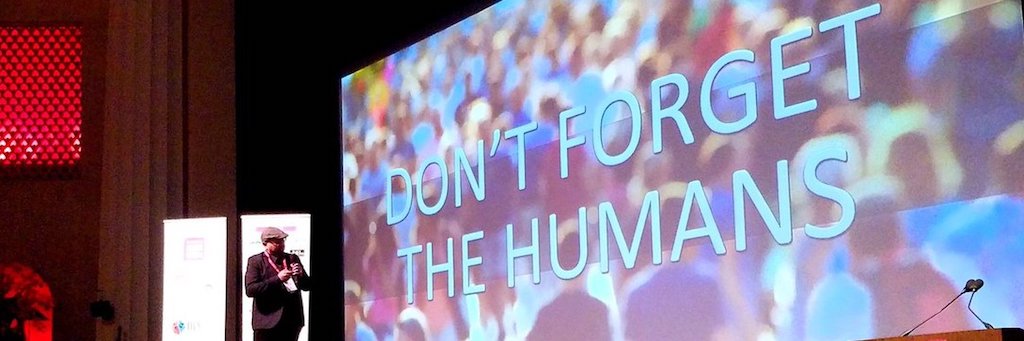
I am now on a mission to make sure that the web is inclusive to all people, making rich internet experiences available for all. I believe a great user experience includes performance and accessibility. A few years back, I started speaking about digital accessibility at conferences as a way to get over my fear of public speaking. This is something I am still working on...
Along the way, I have also been able to publish some courses on the Pluralsight platform. Focused mainly on a developer audience, I have produced Foundations of Accessible Web Design, Testing Techniques for Web Accessibility, Screen Reader Compatibility Testing for Web Accessibility, and ARIA Foundations for Web Accessibility. Through relationships with Pluralsight, the course is used officially in large organizations to educate developers on digital accessibility. It is even used as part of a Google Africa Developer Scholarship.
The courses are helpful to Project Managers, Designers, Developers, and testers so everyone has an opportunity to learn based on my 10 years being focused on accessibility. I'm ashamed to say I have probably failed more times than you have even attempted.
When I am not trying to raise awareness for digital accessibility at front end and Accessibility conferences around the country, I am probably taking a nap or drinking Zombies at a Tiki bar.
This site
The site was designed by Justin Reonardy. I had a long list of requirements for him, with accessibiliy being the most important. He worked really hard to come up with a color pallete that provided some great (mathematical) color contast ratios, with most ratios meeting WCAG AAA of 7:1 or better. Whether this makes a difference for readers will be determined in time. Justin was also able to drop in some pops of color with the iconography, and I also had him think about typography and spacing. He could have gone super gaudy and outrageous, but... that's not really my style. My goal was to have a simple site that designers could appreciate, but also serve as an example of how beautiful accessibility can be when intentional. I am not a designer, I have no design sensibility, but I am happy with what he was able to come up with, and my designer friends seem to like it.
I chose not to minify any assets, like CSS or HTML. I instead chose to be as efficient as possible so that I can leave all the code untouched and easily inspected. You can view-source on everything to see all my decisions and mistakes. Being able to view-source was huge in my learning, and I wanted to preserve that for others.
The tech stack is not really exciting by today's front end engineering standards. When it was time to build, I experimented with a bunch of different static site generators. NPM and dependency fatigue set in really fast so I decided to go simple and barebones. In the end, this site is just HTML and CSS, only relying on a classic directory structure for organization. No pre/ post processing, not even any server side technologies like PHP. I didn't want to have play the dependency update game every time I wanted to write. The outcome is that I have a very lean site that I have total control over. After 25 years as a developer, I am back full circle to simple text files and FTP, and it has been extremely liberating. This site, which is using nothing more than a glorified notepad, does not require much to operate. I might maybe miss the ability to easily include content, like the header and footer, or automatically update the copyright automatically but Find and Replace in my editor has been sufficient enough.
No JavaScript. No cookies. No social media sharing. No 3rd party ads or analytics. Just plain content!
I chose not to minify any assets, like CSS or HTML. I instead chose to be as efficient as possible so that I can leave all the code untouched and easily inspected. You can view-source on everything to see all my decisions and mistakes. Being able to view-source was huge in my learning, and I wanted to preserve that for others.
I tried not to go too overboard with the CSS classes. Relying on the markup, unique id's, and utility classes mean that when I made shortsighted mistakes in styles I didn't have to touch the markup too much, which was really important since I did everything by hand. If complex systems fail in complex ways, requring complex fixes then what does that say about simple systems? When it comes to the web, I like to quote Lauryn Hill:
♫ It could all be so simple, but you'd rather make it hard...